Chef Secure
A brand identity for a brand new business.


Chef Secure is an online learning platform for topics in cyber-security. Their comprehensive instructional videos make it easy for developers to learn how to locate and fix security vulnerabilities in web applications. 30North Digital helped Chef Secure create a consistent visual design and branding guidelines for their new business.
Chef Secure aims to make complex cyber-security concepts easily digestable. Being a content-driven company, it is necessary for their website to demonstrate this content in a straight-forward, yet visually-appealing manner. 30North Digital worked with Chef Secure to craft a visual and information design which reinforces their core values: quality, simplicity, and accessibility.
The results were very professional and high quality, but most importantly, designed with care for our users.
We’ll be using 30North Digital’s services for future projects and highly recommend them to others.
We allowed the content to take center stage in the designs, with additional embellishments added to increase aesthetic appeal, as well as draw the user's focus to the next piece of content.
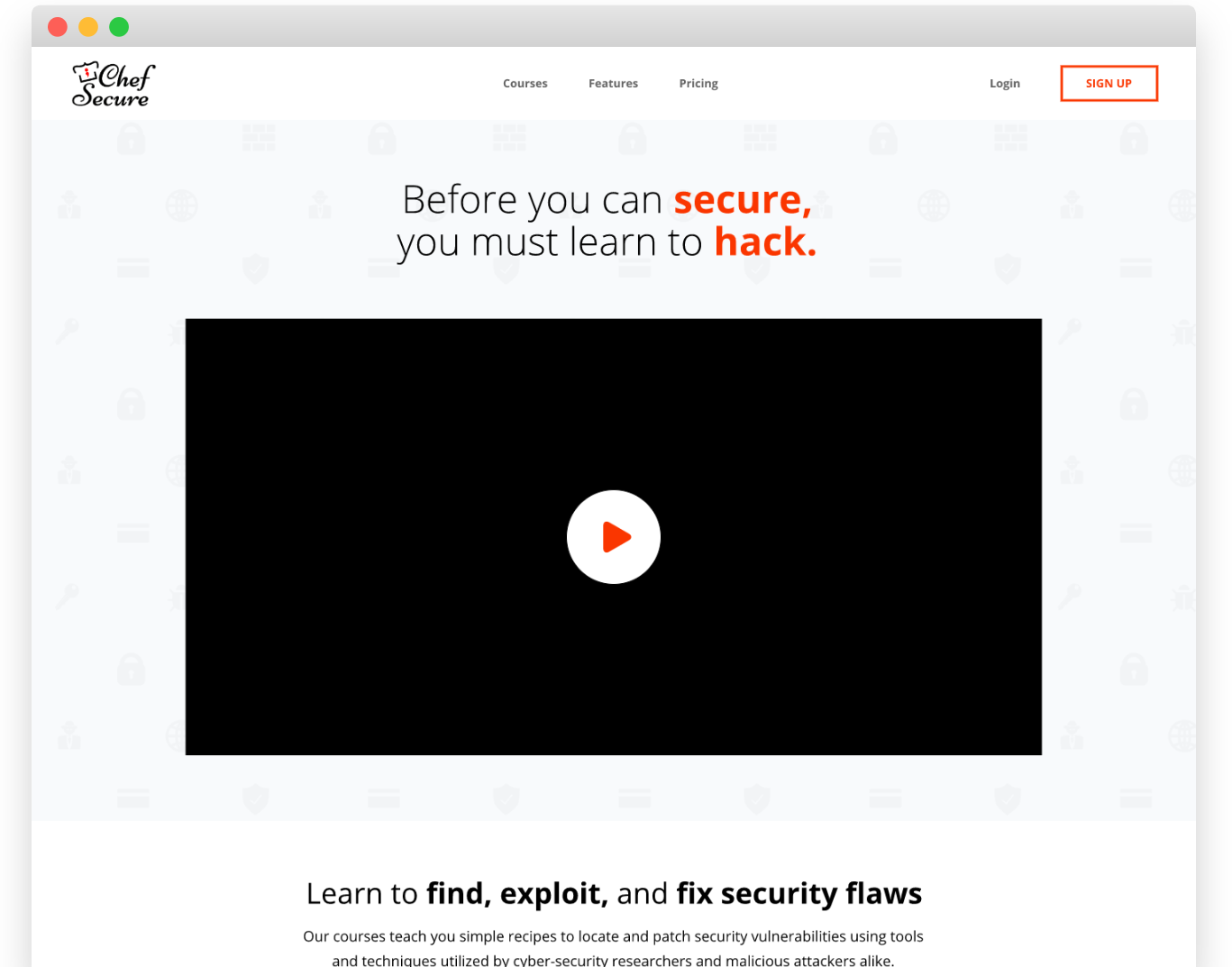
Being primarily focused around instructional videos, it made sense to integrate video content as much as possible. The large video at the top of the Homepage stands out prominently and immediately grabs the user's attention. It serves as a brief introduction and overview of what to expect with Chef Secure's services.
The Call to Action immediately following this introduction invites the user to the Course Overview page. Here they will find another video placed front and center, detailing what the user will learn by taking the course.
Most pages follow a similar pattern, displaying a large video near the top, followed by relevant details such as features, descriptions, reviews, and other information the user may need before purchasing.
We took great care to ensure every element and component was intuitive to interact with. Any un-necessary distractions which could pull the user's focus away from the content were eliminated or minimized. The result: a user experience which is instantly understood at a subconscious level.